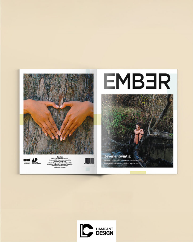
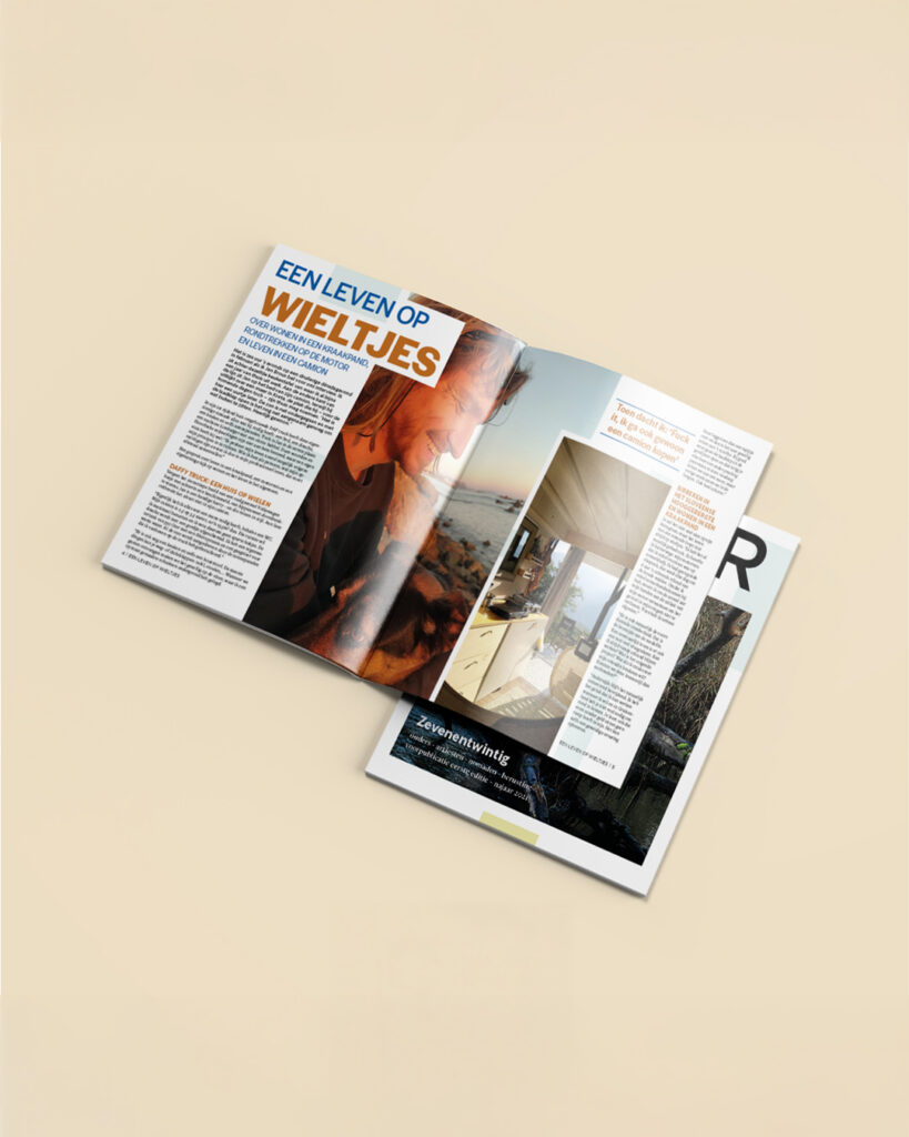
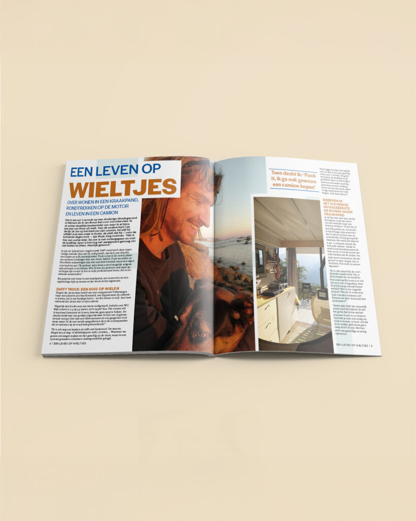
In collaboration with Ember, I designed a prepublication magazine to give readers a first look at their yearly release. The goal was to create a visually engaging teaser that reflects the style and tone of the full publication while highlighting key content and themes.
The design focused on clean layouts, dynamic typography, and compelling visuals to draw readers in. Each page was carefully composed to balance readability and visual impact, ensuring that the magazine is both informative and visually appealing.
Working on this prepublication allowed me to experiment with structure, pacing, and graphic storytelling, resulting in a polished teaser that builds anticipation for the full release. This project showcases how magazine design can combine functionality, aesthetics, and brand identity in a small-format publication.